Dafont Web Page Redesign
Dafont günümüze kadar çoğu tasarımcı olmak üzere çeşitli kullanıcıya hizmet veren bir font web sitesidir. İçince yüzlerce farklı font tasarımcısının ürettiği binlerce çeşit font bulunmaktadır. Üye olan herkes kendi fontunu yükleyebilmekte ve paylaşabilmektedir. Tüm fontlarını indirmek ücretsizdir.
Dafont is a font website that serves a variety of users, mostly designers. There are thousands of fonts produced by hundreds of different font designers. Anyone who is a member can upload and share their own font. All fonts are free to download.
---------------------------------------------------------------------------------------------------------------
Home Page
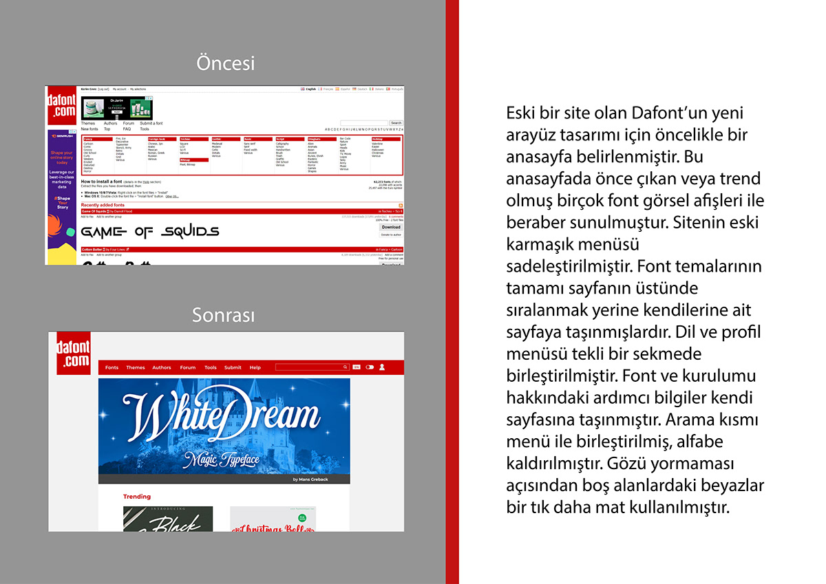
Eski bir site olan Dafont’un yeni ara yüz tasarımı için öncelikle bir ana sayfa belirlenmiştir. Bu ana sayfada önce çıkan veya trend olmuş birçok font görsel afişleri ile beraber sunulmuştur. Sitenin eski karmaşık menüsü sadeleştirilmiştir. Font temalarının tamamı sayfanın üstünde sıralanmak yerine kendilerine ait sayfaya taşınmışlardır. Dil ve profil menüsü tekli bir sekmede birleştirilmiştir. Font ve kurulumu hakkındaki yardımcı bilgiler kendi sayfasına taşınmıştır. Arama kısmı menü ile birleştirilmiş, alfabe kaldırılmıştır. Gözü yormaması açısından boş alanlardaki beyazlar bir tık daha mat kullanılmıştır.
First of all, a home page was determined for the new interface design of Dafont, which is an old site. Many prominent or trending fonts are presented with visual banners on this homepage. The old complex menu of the site has been simplified. All of the font themes have been moved to their own page instead of being listed at the top of the page. Language and profile menu combined in a single tab. Helpful information about the font and its installation has been moved to its own page. The search part has been merged with the menu, the alphabet has been removed. In order not to tire the eyes, the whites in the empty areas are used a little more matte.
---------------------------------------------------------------------------------------------------------------
Fonts List
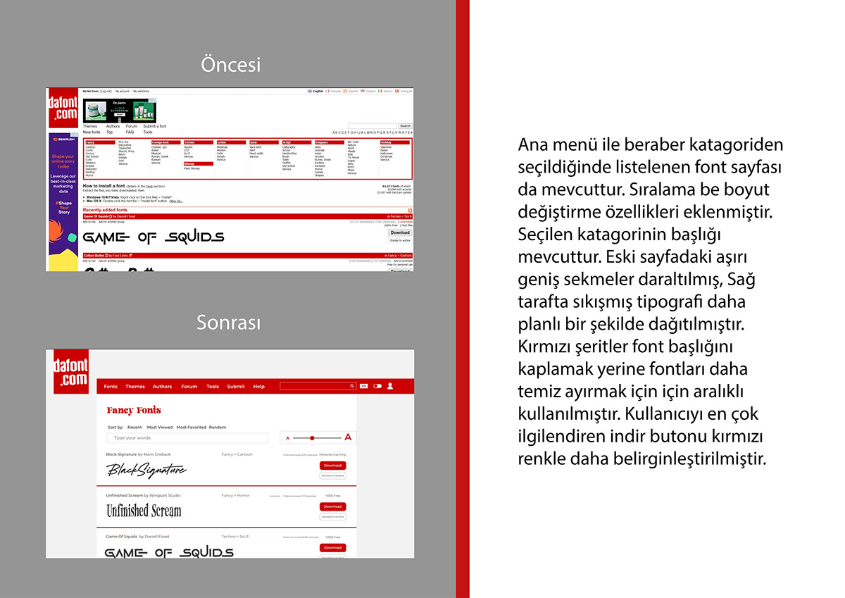
Ana menü ile beraber kategoriden seçildiğinde listelenen font sayfası da mevcuttur. Sıralama be boyut değiştirme özellikleri eklenmiştir. Seçilen kategorinin başlığı mevcuttur. Eski sayfadaki aşırı geniş sekmeler daraltılmış, Sağ tarafta sıkışmış tipografi daha planlı bir şekilde dağıtılmıştır. Kırmızı şeritler font başlığını kaplamak yerine fontları daha temiz ayırmak için için aralıklı kullanılmıştır. Kullanıcıyı en çok ilgilendiren indir butonu kırmızı renkle daha belirginleştirilmiştir.
Along with the main menu, there is also the font page that is listed when selected from the category. Sorting and resize features have been added. The title of the selected category is available. The overly wide tabs on the old page have been narrowed down, and the typography stuck on the right has been more deliberately distributed. Red stripes are used intermittently to separate the fonts more clearly, rather than covering the font title. The download button that interests the user the most is highlighted in red.

---------------------------------------------------------------------------------------------------------------
Font Details Page
Ana menü ile beraber kategoriden seçildiğinde listelenen Fonta tıklandığında girilen kendi özel sayfası büyük beyaz bir sayfada düz sıralı liste olmak yerine fontun afişini daha ön plana çıkaran ve temiz bir şekilde tanıtan bir tasarıma geçmiştir. Font sayfası da mevcuttur. Sıralama be boyut değiştirme özellikleri eklenmiştir. Seçilen kategorinin başlığı mevcuttur. Eski sayfadaki aşırı geniş sekmeler daraltılmış, Sağ tarafta sıkışmış tipografi daha planlı bir şekilde dağıtılmıştır. Kırmızı şeritler font başlığını kaplamak yerine fontları daha temiz ayırmak için için aralıklı kullanılmıştır. Kullanıcıyı en çok ilgilendiren indir butonu kırmızı renkle daha belirginleştirilmiştir.
When selected from the category along with the main menu, its own special page, which is entered when the Font is clicked, has switched to a design that brings the banner of the font to the forefront and introduces it in a clean way, instead of being a straight-line list on a large white page. Font page is also available. Sorting and resize features have been added. The title of the selected category is available. The overly wide tabs on the old page have been narrowed down, and the typography stuck on the right has been more deliberately distributed. Red stripes are used intermittently to separate the fonts more clearly, rather than covering the font title. The download button that interests the user the most is highlighted in red.

---------------------------------------------------------------------------------------------------------------
Themes Menu
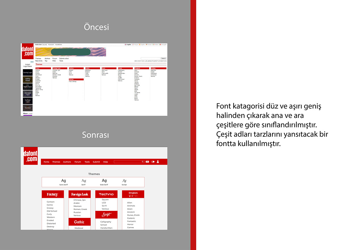
Font kategorisi düz ve aşırı geniş halinden çıkarak ana ve ara çeşitlere göre sınıflandırılmıştır. Çeşit adları tarzlarını yansıtacak bir fontta kullanılmıştır.
The font category has been classified according to the main and intermediate types, leaving the flat and excessively wide form. Variety names are used in a font to reflect their style.

---------------------------------------------------------------------------------------------------------------
Top Authors List
Font tasarımcılarının listesi daha düzenli bir hale getirilmiştir. Kullanıcı adı yanında hafif gri tonuyla yazılı indirme sayısı ayrıştırılmıştır. Ülke listesi sona, en çok katkı sağlayan kullanıcı listesi başa alınmıştır.
The list of font designers has been streamlined. Next to the username, the number of downloads written in a light gray tone is separated. The country list is at the end and the top contributor list is at the beginning.

---------------------------------------------------------------------------------------------------------------
Login Page
Üye girişi sayfası gri alan üstünde ortalı ve düzenli bir hale getirilmiştir.
The member login page is centered and organized on the gray area.

---------------------------------------------------------------------------------------------------------------
Logged in Home Page
Üye girişi yapıldıktan sonraki ana ekran kullanıcıyı selamlayan bir başlık ve simgelerden oluşan görsel düzenli bir menü haline getirilmiştir.
After login, the main screen has been transformed into a visually organized menu consisting of a title and icons that greet the user.

---------------------------------------------------------------------------------------------------------------
Dark Mod

---------------------------------------------------------------------------------------------------------------
Eski halinde tekrar düz yazı olarak yazılmış dosya yükleme bölümünün kullanıcıya sorduğu soru sonuçlarıyla beraber iki renkte bloklar halinde ayrıştırılmıştır. Bilgiler gri alan üzerinde negatif şekilde kullanılarak gözü yormayacak ve sınıflandırılmış blok düzenine uygun duracak bir şekilde yazılmıştır.
The file, which was written in plain text in its old version, has been separated into blocks in two colors together with the results of the question asked by the uploading section to the user. The information is written in a negative way on the gray area, in a way that does not tire the eyes and is in accordance with the classified block order.

---------------------------------------------------------------------------------------------------------------
Eski halinde tekrar düz yazı olarak yazılmış dosya yükleme bölümünün kullanıcıya sorduğu soru sonuçlarıyla beraber iki renkte bloklar halinde ayrıştırılmıştır. Bilgiler gri alan üzerinde negatif şekilde kullanılarak gözü yormayacak ve sınıflandırılmış blok düzenine uygun duracak bir şekilde yazılmıştır.
The first menu of the tools page, which contains the programs used for font design, has been made to leave less space and better parse with horizontal listing instead of vertical. The programs have left the flat list view by keeping the images separately with a neater paragraph layout within the dark and normal red blogs.

---------------------------------------------------------------------------------------------------------------
Yardım menüsü FAQ yerine daha bilinen Help kelimesi ile yazılmıştır. Yine liste görünümünden uzaklaşılarak pozitif be negatif 2 blok oluşturularak yatay ve sade bir düzen kurulmuş, soru kısmı ve cevap kısmı karşı karşıya yerleştirilmiştir. Solda seçilen başlığın karşılığındaki cevap sağ blokta değişmektedir.
The Help menu is written with the more familiar Help word instead of FAQ. Again, by moving away from the list view, a horizontal and simple layout was established by creating 2 positive and negative blocks, and the question part and the answer part were placed face to face. The answer to the title selected on the left changes in the right block.

---------------------------------------------------------------------------------------------------------------
Sitenin forum sayfası aranan fontlar ve genel konular olarak ikiye ayrılmıştır. Bu konu başlıkları ve verileri yakın ve renk farkıyla daha belirginleştirilmiştir. Aranan font bölümünde sadece görsel yerine kullanıcı, başlık ve tarih de eklenmiş ve harf koyu bir gri ile gruplanmıştır. Genel konularda da aynı liste yapılmıştır. Son 5 gönderiyi gösteren ön izlemenin altında asıl listeye götürecek ‘’Hepsini göster’’ butonu bulunmaktadır.
The forum page of the site is divided into two as searched fonts and general topics. These topics and their data are made more specific by closeness and color difference. In the searched font section, instead of just the image, the user, title and date are also added and the letter is grouped with a dark gray. The same list was made for general subjects. Under the preview showing the last 5 posts, there is a "Show all" button that will take you to the main list.

---------------------------------------------------------------------------------------------------------------
Forumda paylaşılan gönderinin kendi sayfasında kullanıcıyı gönderiyi ve yorum kısmını ayrıştıracak bir tasarım kullanılmış ve tekrar düzenli bir grup oluşturulmuştur.
On the own page of the post shared in the forum, a design was used to separate the user from the post and the comment section, and a regular group was created again.